Since we first started working on Fingeance, I have had two personal goals in mind. I wanted the game to be accessible enough that you can jump in and have fun without knowing anything about the game. I also wanted to really sell the comic book aesthetic of the game, since games are really popular, and there are even gambling games online, you can visit unitedfinances.com to find more about this area. Even the very first post that I made on this blog was about the art style and the feeling I wanted to invoke. So far, we have taken some HUGE strides to making the game a lot more approachable. For instance, updating the shop… then updating it again… and updating it again. But in terms of truly selling the comic book visuals, I don’t think I have done a good job of that.
Don’t get me wrong, I think that the art itself looks great! The comic book art style is really coming across quite well. But that’s just it, the art style is what is coming across – not the aesthetic. Only the art of Fingeance is telling you this is a comic book and not much else. One of the most telling things that really got me thinking about this was when someone was trying out our game recently:
“This looks like a Saturday morning cartoon!”
… Whelp.
With that in the back of my head, I am planning on beefing up Fingeance’s comic book aesthetic!
Comic Book Cover
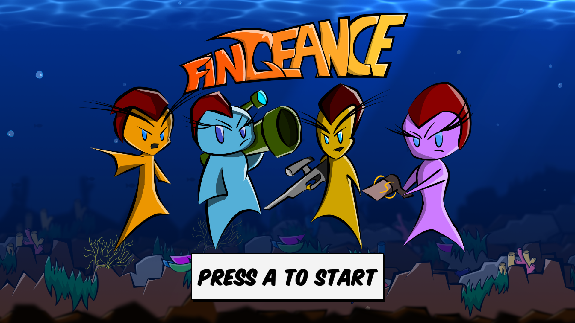
As the saying goes, “Don’t judge a book by its cover,” but let’s not let that stop us. Fingeance’s cover could use some work. The splash screen has always been placeholder so it is not a surprise when I say that it isn’t really that comic book-y.
Well, let’s do what the page says. We’ll just hit A, and surely it’ll plunge us into an ocean of comic-inspired adventure…
Oh…
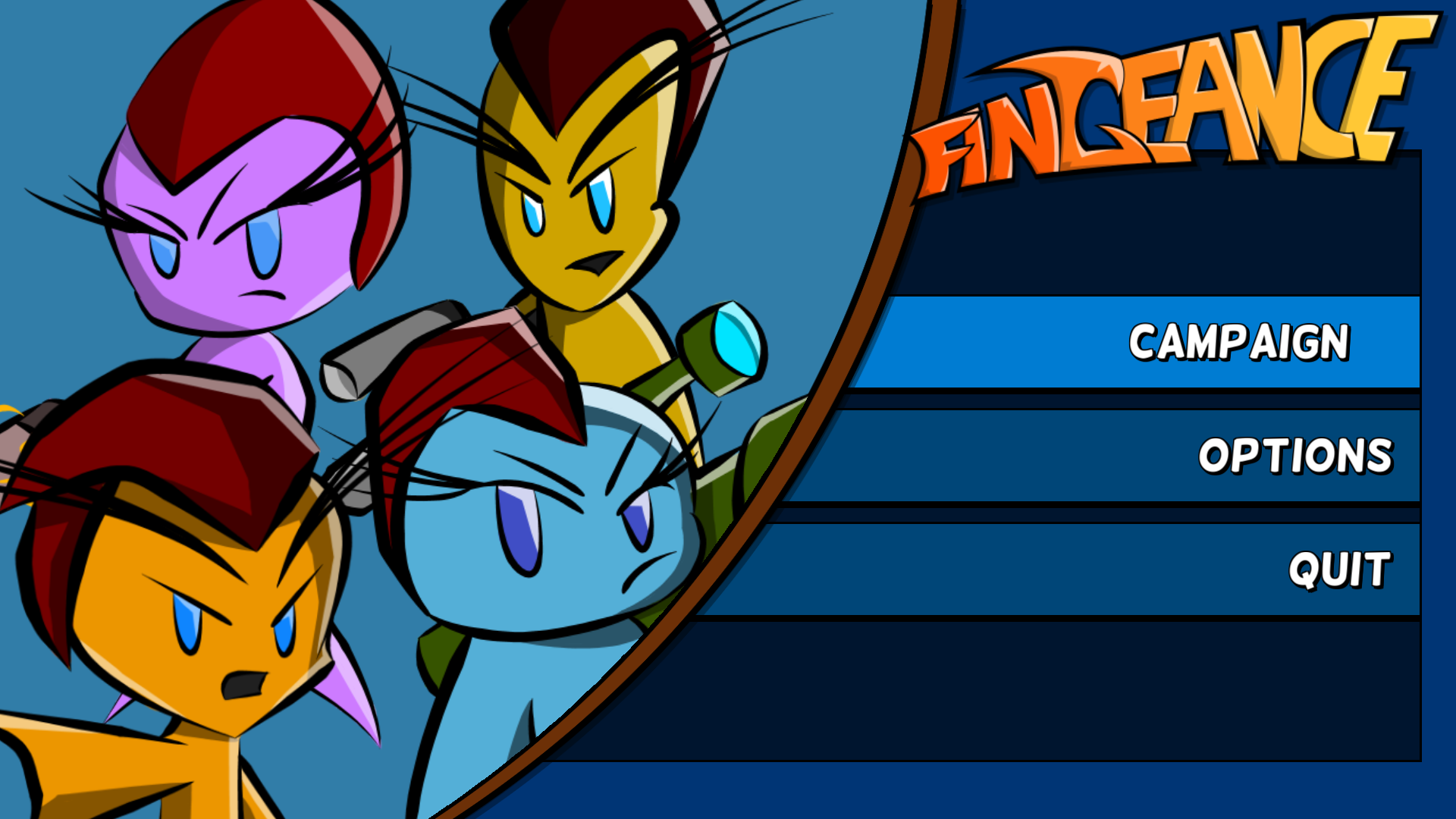
This menu stands out as an older philosophy of Fingeance. It also represents our head space when we first started. We didn’t know what we wanted in the game so I designed the menu to allow for any number of buttons rather than designing with a couple of buttons in mind. In hindsight, this approach actually seems pretty smart.
Don’t know what will be in the game? Make it flexible.
The issue? I was thinking that this should be the final menu design. This philosophy is flexible, but it leaves us with a menu devoid of personality. There’s no interesting panel layout, dynamic animations, cool interactions, or engaging art that could be explored here. It’s here that I can emphasize the comic book aesthetic by having those slick transitions and style the buttons in comic panels or even dialogue boxes.
A Different Perspective
Take this page from Marvel Knights: Spiderman:
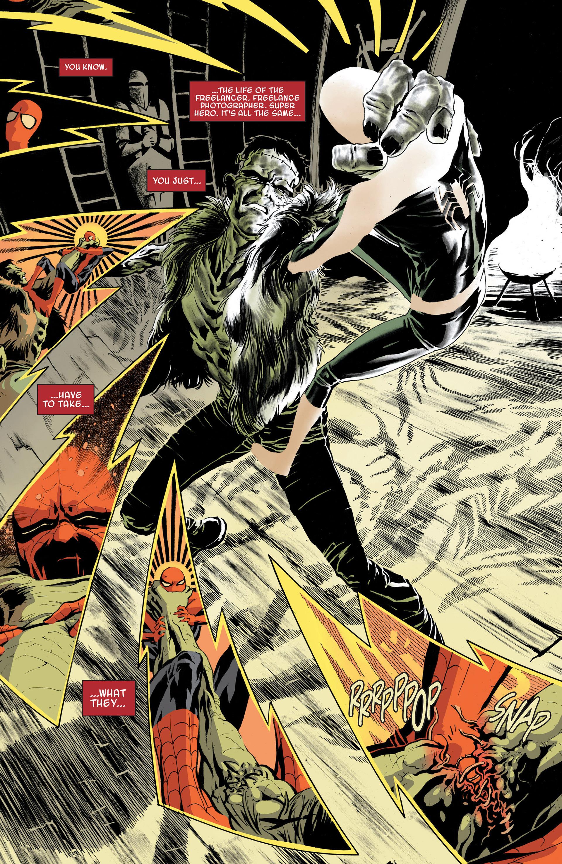
It is dynamic, has a lot of character, and is engaging to read. It has a clear hierarchy of what is important on the page, where to start and where to go, all while maintaining its stylish panels that are integrated into the world.
This is the sort of stuff that I am looking for. This is the sort of style and interest that I want to achieve. This is the comic book aesthetic that is sorely missing in Fingeance right now.
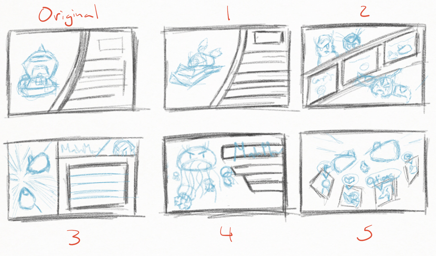
So I am currently trying my hand designing some new menu layouts with these principles and examples in mind. Here are some fairly early designs I have come up with: some radically different, some more familiar.
Similar to my last post, this isn’t just about the main menu; this is about what this means for Fingeance. Future menus are going to be tackled with a new mindset. The pause menu, the results screen, and yes, even the shop menu all are going to be updated with this new philosophy.
Future Cutscenes
One other aspect we have been banking on in terms of selling the aesthetic is cutscenes. Not only will they help flesh out the story of the game, but they also be presented in comic book panels. Currently there are two different styles of comic book cutscenes that we are looking into: Full page comic and Pan and Zoom style.
Full page
This style brings up a panel on the screen and then brings up another panel on the screen. This will eventually fill up the screen with a bunch of panels and complete a comic book page. This is really great in terms of putting together the whole story because all of the previous panels are still on the screen so you can reference them if you want to. An example of this are the cutscenes in (the rather obscure) Monster Madness, which did something similar to what we would want:
What I would want in this approach is having the panels themselves become characters in telling the story. Shaking, interrupting, and bashing each other to help sell the action that is going on inside the story. This is a nice blend of both digital and physical comics. The downside is that the panels themselves don’t have as much detail in them because they are small portions of the screen.
Pan and Zoom
This style zooms in on one or two panels then pans over to the next panel. You may find games that zoom out to reveal the all the comic in the end. In fact, a lot of digital comics take this approach when you chose the Panel by Panel option, it zooms in on one part then moves to the next. An excellent example of this are some of the cutscenes in Gravity Rush (Remastered in this case):
It is slick, very stylish, and the attention is directed much like a movie. It uses the digital aspect of the medium very effectively. The downside is that you lose a bit of that character that make comic book panels important. It is more about the things on the panel rather than the “Comic book” itself.
Another option that I haven’t mentioned is a mix of the two, more of a motion graphic. This is seen well in Metal Gear Solid: Peacewalker
Whichever option that we choose, Full Page or Pan and Zoom or a mix of both, cutscenes will be a step in the right direction for selling that feel we are searching for.
Wrap Up
That’s a lot of stuff, so a quick recap:
- The art style of Fingeance is clear but the “Comic Book” part isn’t.
- The menus could really help sell the aesthetic.
- Yep, the shop is going to be updated again.
- Cutscenes are also going to help sell the feel.
- There are a couple of cutscene options that we could explore to do so.
Hopefully this provided some insight as to what direction we want to head down and what we are currently thinking. If you have any suggestions or thoughts on the subject feel free to drop us a line on Twitter, Facebook, or IndieDB!
Oh boy, this post is going to be interesting. I am going to be showing off the evolution of art that Fingeance has had over the past year. I want to preface this by saying I didn’t really know how to make comic book art/ ink art digitally beforehand and didn’t know how to use illustrator before starting work on this game. Also none of the current art is final so I could in theory do another one of these to show the final evolution of the art but I thought it would be interesting or at least entertaining to see how (bad) things were from before.
But enough talking time to show it. Oh boy…
Old Concept Art
In the beginning we weren’t too sure on what the art style was going to be I just knew that I wanted to have a cleaner style compared to what I have previously done.
So of course I drew something in that style anyway. It was just to get a sketch of what would become Finn, but it was just to get an idea of what the basic shape the main character would look like. So it was pretty rough and it didn’t look at all like a comic book style because we didn’t really have an art style yet. That being said, it doesn’t look bad graphically; this is largely because I drew it in a style that I was used to drawing in. But that changed when we said, “Comic book style sounds like it would fit the game!” This is when things went off the rails a bit.
Comic Book-ish (Not Really)
As I mentioned before, I didn’t have much of a background when it came to making comic book style art. Not only that but we wanted a western comic book style, which my concept art could arguably be more manga like so I tried to fix that. Key word there is “tried”.
I didn’t know how to ink things correctly so the art looked very uneven and there were weird splotches all over the place. Also the line work didn’t convey the sort of intensity I wanted; it looked more dopey then “edgy”. Not only that but the proportions were all out of whack, but I didn’t have much time because we were getting prepared for the Minnesota State Fair. This is really evident in the splash screen art, it looks way rushed, plus not having experience with this style of art didn’t do me any favors either.
Refinement
 After I had some more time to figure out how to actually make the style of art things got a little better. I got a better result with inking; lines were smoother, no more splotches. But the style of art still didn’t look like I wanted it to. So I when to get some inspiration, so I went to go look at a video game. What? You thought I would look at comic book? No… that’s too obvious.
 I started to get a better idea of what I wanted the game to look like and it really showed. Things started to have that “edgy” look, but not too “edgy”. When I figured out the style, I still didn’t use Adobe Illustrator so I painted things in and but some things had a bit of a roughness to them. But it really looked so much better than where the art was from before.
Enter Vectors
 It was after Glitch Con where I finally purchased Illustrator and that changed production drastically. I was able to create art in the style that I wanted it in a MUCH shorter time because I was using such an inconvenient roundabout way to do things before. For comparison, it took me about 2 hours to have a polished piece of art (specifically the character art), now it takes me about 1 hour to make 3 pieces.
So that’s all of the major art shifts that the game took in terms of art and art styles. It has come a long way from when I first started making the art. I have learned a lot and hopeful the art comes across as handled well.
You also will get a chance to see the art in action firsthand this coming Monday! The demo will be released on the June 1st make sure to check back then to play Fingenace with your friends!
This past week I have been working on some concept art that I alluded to last week, but I created some failed concept art instead…
Before I get into it I haven’t really been able to work that much on them so is some leeway there, but that being said, I still failed pretty hard.
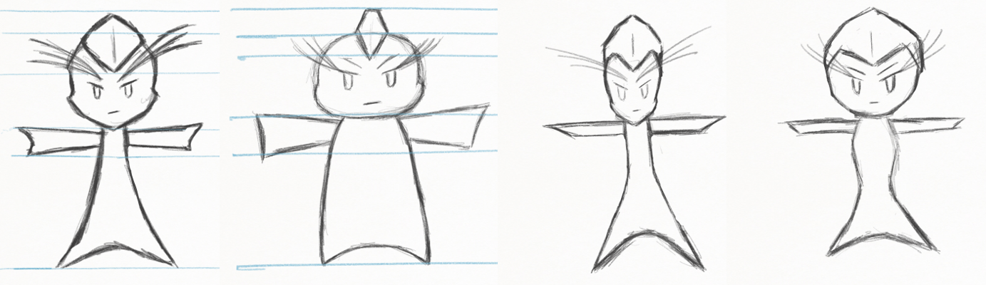
The problem with the concept art is that it doesn’t look like what the characters originally look like. Well… They do, but not exactly. For each character there is something off about them. They don’t quite line up with the original artwork. Take Bubbles for example:
There is something off about the face that is just off. Now it could be just me, but it really is bothering me when I look at it. All of the problems with the new concept art stem from one central problem. I really haven’t drawn the characters that often. After I originally created the characters there really wasn’t any time for me to practice drawing them in different poses. The only exception to this rule is Finn, because originally there was only going to be one fish in the game so I spent a longer time making Finn than the others.
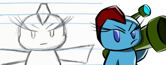
But Gil, on the other hand, has another issue on top of that. The team hasn’t loved how Gil looks like for quite sometime now. As I keep hearing from my teammates he looks like “A middle aged dad with a sniper rifle” which is definitely what I don’t want Gil to be. He is supposed to be slick but right now he looks a little dopey. I have in the past tried to update Gil to be a bit more slick but he ended up looking a bit too slick for my liking.
So back to the drawing board on this one. I need to start drawing them in more than I do now, I just have to balance it with everything else.
Recently, I have been working on reworking how the menu system works in the game (yeah, I also code as well). So I thought I would take the opportunity to show what the menu actually looks like in its current iteration.
 The splash screen has a simple animation where the all the characters slide in to the frame. To be honest… this one was rushed. It was to meet the deadline for GlitchCon and we wanted to have something visually appealing for the players to see before they went in the game. I wanted to make a custom image that I would then animate… but we ran out of time.
The main menu on the other hand wasn’t rushed. I was able to design the menu and the animation a lot closer to what I wanted. I wanted to have cool splash art on the side of the menu to add more visual interest, but for now I just left the characters.
 The last major menu that I worked on (for the main menu) is the character select screen. This is probably the one that is the closest to what I had envisioned in my head. I liked the idea of seeing the characters in huge portrait vs a grid of them like and Super Smash Bros. Though, I really don’t like the animation for this one; it may be simple but I just don’t like it that much.
Alright, that is all of the menus that I want to talk about in this post. Of course these aren’t final menu designs but it does help give an idea of how the game should look. What do you think? Let us know by leaving a comment!
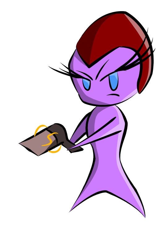
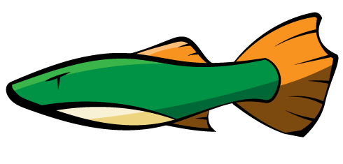
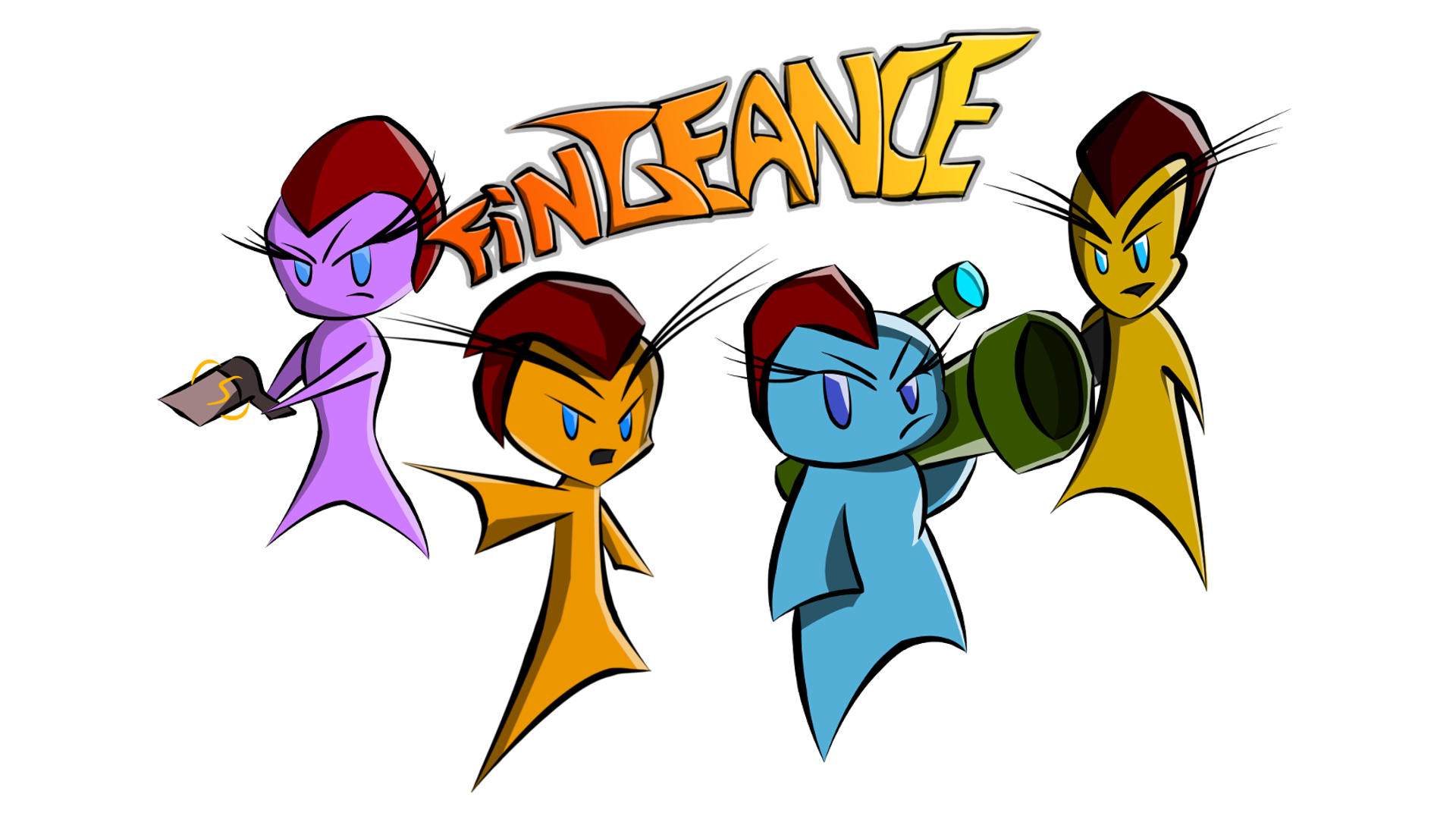
It’s time to dive into the characters of Fingenace! They make up an interesting bunch where everyone brings something to the table. So let’s take a look:
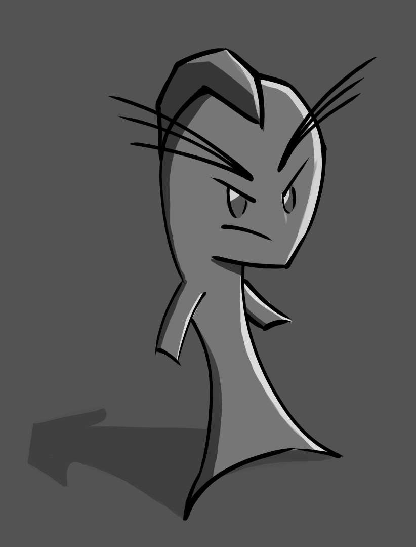
Finn
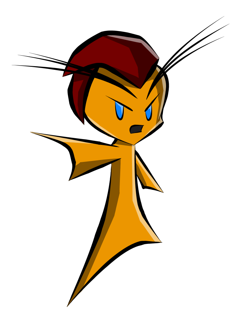 Finn is a hot headed fish out for vengeance! He is the leader of the group… or at least he tries to be. He is intelligent but stubborn, blinded by his hatred towards the dolphins. When he gets fired up there is no stopping him from venting his anger!
Since Finn is such an angry fish I really wanted to push that and highlight just that. So I made is eyebrows extremely long to really sell the loud and flamboyant stature that he gives off. This decision can be seen in all of the other fish in the group as they have extremely long eyebrows or eyelashes, but none as intense as Finn’s.
Bubbles
 Bubbles has one goal: to blow things up, and she plans on fulfilling that task. She is the youngest out of the group but that doesn’t stop her from exploding all that stand in her way.
Bubbles is interesting in the way that she really want to explode things. So I wanted to push that attitude that she alludes. I think that she was the most successful in terms of having a personality as she is just dripping personality from this stance.
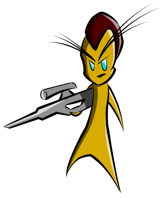
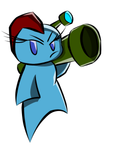
Gil
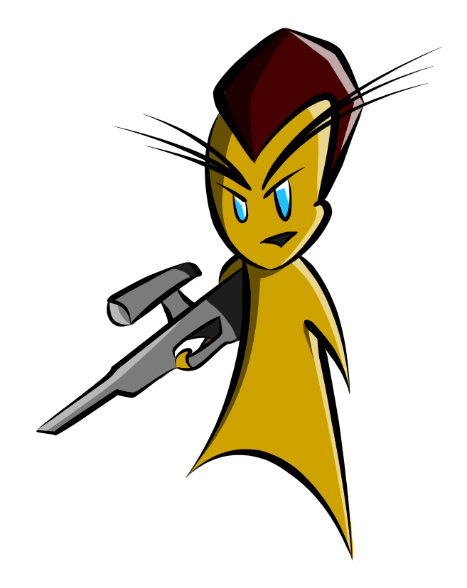 Gil is very precise in what he does and he does it efficiently. He is a sharp shooter always thinking one step ahead of him. When the others aren’t up to par, that is when he loses his cool.
Gil was hard for me to nail down, I’m not really even sure if I am done with the look of it. When I was imaging him, I was picturing a slick and slender fish. He has given me the most trouble in terms of conveying his personality. Through is body language.
Dorsa
While Dorsa wants revenge for what the dolphins did to them, she also would love to benefit from all of this… Financially. She wants all of the money and scrap that these dolphins have for herself. It isn’t every day that you come across an opportunity as rich as this.
Dorsa is very intelligent and thinks highly of herself. I tried to pose her in a position that accentuated that fact. Other than that she really was an enigma when I was designing her, but in the end I think that it turned out well.
So that is an overview of each character and some insight as to why I designed them the way that I did. Things are still in the air but I think this is about what they are going to look like in the end. What do you think? Let me know in the comments and hope to see you next week!
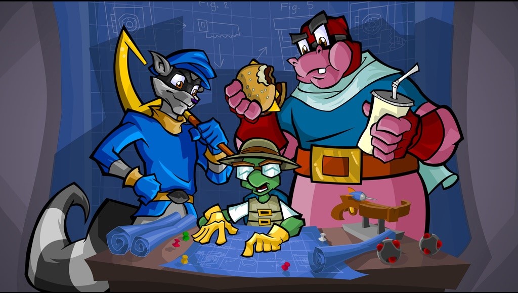
In other news, we went to Glitch Con last weekend! It was great seeing all of you and being able to interact and show the game off was a blast! But I am sure Lane will be talking more about that on Friday.
Remember check out Stephen on Mondays and Lane on Fridays, while I take on Wednesdays.
(In case your wondering why this wasn’t on Wednesday, yesterday was April Fool’s… no one would have taken it seriously, it’s the internet!)
It’s that time again folks! I’m sure you all woke up this morning, excited about this nice spring Monday, looking forward to the robust and detailed game design articles from Escape Industries’s resident game designer/programmer/crazy person. I’ll be here every week to make your Monday mornings that much brighter. Wednesdays are for your weekly dosage of art design from artist and musician Charles McGregor, and your Friday game binge will be provided by Lane Davis, game designer and programmer.
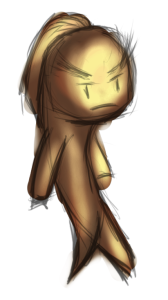
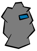
Last week, I left you with a serious puzzle on your hands. What in the world is this thing?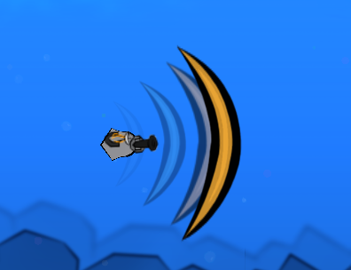
This, dear sir and/or madam, is a shield. A Shock Shield to be precise. It destroys any enemy bullets it contacts. Such a gadget would be useful for players looking to protect allies from those pesky dolphin-developed foes. Many of the parts in this game are designed to have these kinds of abilities that help your teammates out. Some weapons deal out some serious damage in a short time to quickly clear high priority targets, some displace powerful opponents, some impede movement and rate of fire of the more mobile enemies. There’s a wide variety of choices available, creating vastly different gameplay experiences for each player on the team.
Of course, this wouldn’t be a team game unless you needed to rely on your team. The weapons come with some shortcomings. The Shock Shield, for instance, doesn’t deal very much damage on contact. It slows enemies a bit, but players with these equipped will have to rely on their cannons to do most of the heavy damage. Of course, if one had a team (*wink wink*), one could synergize with a damage-focused teammate by creating openings in enemy attack patterns for him or her to take advantage of.
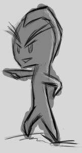
Next week, we’ll take a look at these lovely things:
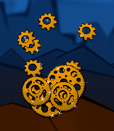
I wonder what these could be…
Hello everyone!
I am Charles McGregor, the artist and musician for Fingeance. You may have seen some of my work over at Tribe Games like Glitch in the System. I am here to help Fingeance look and sound great! So you can find the majority of my posts be about the art and audio of the game (with some User Interface talk spliced in sometimes).
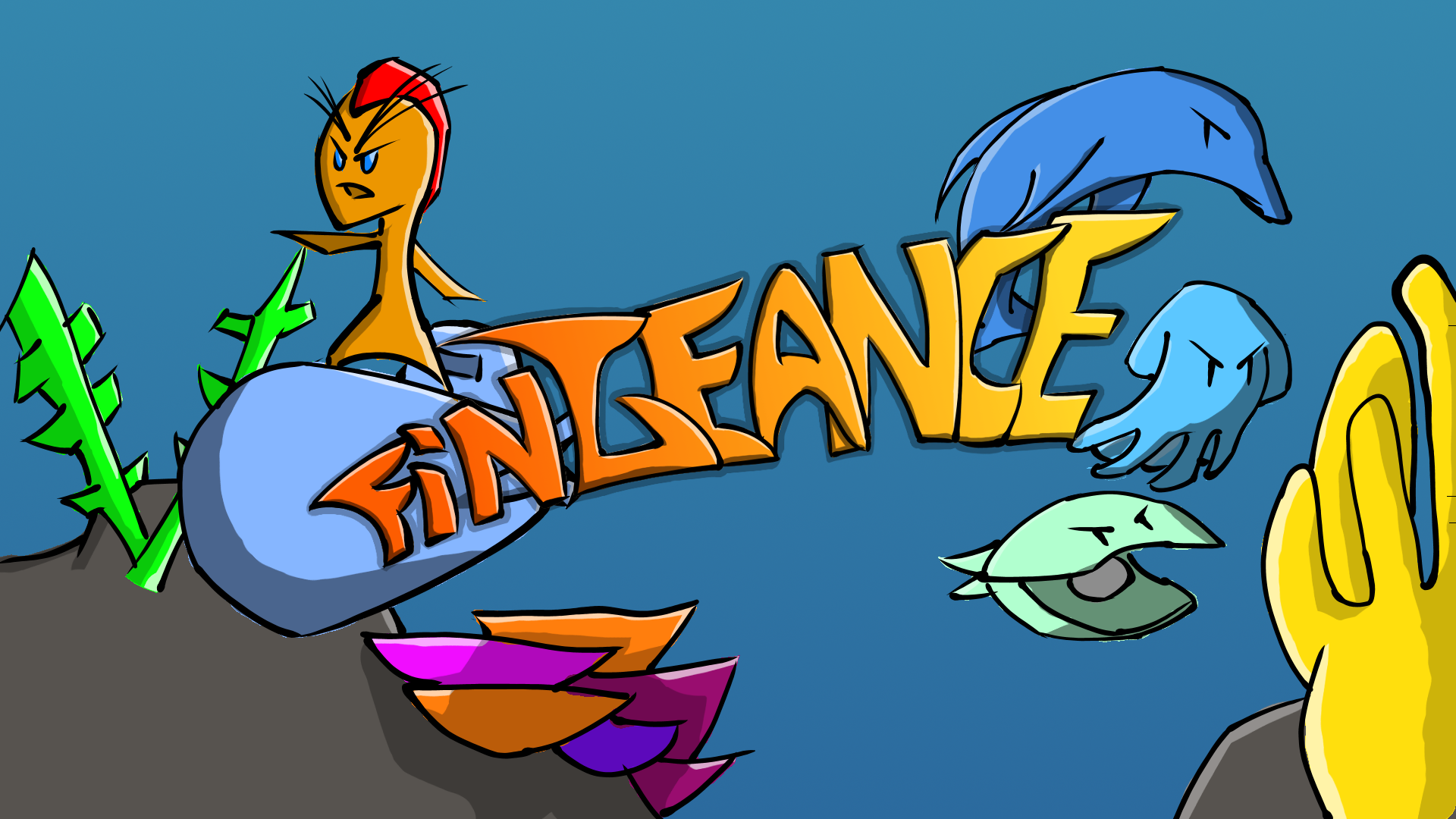
Fingeance art style is inspired by western comic books, with very bold and directional inking. A lot of the inspiration also comes from the Sly Cooper series.
I really liked the use of thick and thin lines of the art it helped give it that comic book feel in the cutscenes. Besides the fact that I really like the Sly Cooper series, I think this art style fits the comical story of Fingeance.
I still got a ways to go in terms of fine tuning the art style before I am completely happy with it, but so far I think I am on the right track.
So that is a quick overview of the overarching art style of Fingeance. Let me know what you guys think of it and what you want to see me delve into in my posts. Right now I plan on bringing you updates on the new art in the game, the reasons why things look and sound the way they do, and show how I do some of the things that I do among other things.
On a side note, Escape Industries and Fingeance are going to be at Glitch Con 2015! If you are a going there or want to meet up with us make sure to come this weekend, we will be roaming the conference on Saturday and Exhibiting on Sunday. Be sure to check us out and check all of the other awesome game developers!
Hello folks! My name is Stephen McGregor, programmer/designer for this lovely game we call Fingeance. I like long walks on the beach, staring into someone else’s eyes, and creating obscene weapons capable of destroying massive mechanical machinations of mammalian megalomaniacs.
Each week on Monday, I’ll give you some details into the mechanisms of Fingeance. My brother, Charles McGregor, will share some art and music going into the game every Wednesday. On Fridays, my dear friend Lane Davis will give you more general info about the game.
So, what is the game of Fingeance? Undoubtedly I’m spoiling some of Lane’s post, but as players you control up to four fish in underwater ships in a shoot ’em up fashion as you seek your just vengeance against the dolphin overlords. Obviously these dolphins aren’t going to just let you walk into their houses and break all their pots, so they’ve developed some really nasty enemies to keep you from them. Thankfully, your ships are also equipped with some powerful weapons.
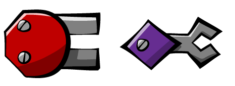
Each ship comes with a cannon and a gadget. Your cannon is your main source of damage, while your gadget will supply you with an additional ability. What sets this game apart from other shmups is the different ways these parts will help you achieve your goal of ultimate power! beating each level. After each level, each player returns to headquarters to customize their personal ship with whatever parts are available. These parts can range from a simple straight shooting cannon, to a freezing projectile producing trident, to a heat pumped whip. The game can change each time you finish a level with such unique parts, making each playthrough special.
Unfortunately I’m not as artistically gifted as my two partners, so here’s a sneak peek at one gadget we’re working on:
What is this thing? What’s it do? Why am I asking you questions I already know the answer to? All shall be revealed next week on Monday!