-
Changing Up the Player HUD
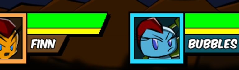
After reworking the Shop Menu and the Character Selection screens I told myself, “No more big systems for a while…” So naturally, I’m working on another big system. This time I am reworking the player HUD (Heads-Up Display, for those unaware) that tells the players what is going on with their ships. Reworked Player HUD…
-
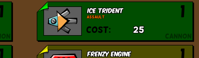
Working on the Shop Menu
-
Animations Add SO Much

-
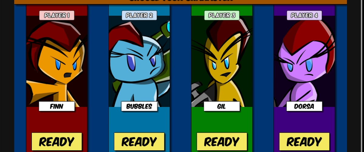
Updating the Menus