Phew!

As we said last week, we’ve finished up a HUGE push. It was pretty intense; we spent a lot of time working on new content for the game. We worked on new enemies, bosses, and environments (like the Kelp Forest). I wanted to take this time to reflect on the experience, talk about what we are doing now, and what is to come.

Push for More Content

The main reason why we were doing this push was to add a ton of content to the game. For the last year, we have really only been polishing up gameplay mechanics and 3 levels (really 2, but I digress). We have reached a point where we needed to figure out what an entire playthrough of our game would look like, how that would feel, and how players actually progress as you play through the game.

So we geared up for a huge push for content in a month’s time; working 14 hour days, almost every day. It was grueling, challenging work, but it was still a blast to work on. Seeing all of the new environments come together, the new bosses taking shape, and the new enemies introduced during this huge push was a humongous morale booster.

Cave Screenshot

I am extremely proud to say that we succeeded reaching our goal. It is now possible to play a full campaign from start to finish (That is SO great to say). It isn’t by any means balanced or final, but it is playable.

But where do we go from here?

Loading…

The most immediate area that I have been working on personally is adding in a loading screen. It really is starting to show that we need some sort of indicator saying, “Hey, the game didn’t freeze, it is just loading right now!” as many times while we play test the game people wonder if the game crashed.

Loading-Screen-Preview-Animation

It is still in its early stages of development but this new loading screen should do a few things:

  1. Tell the player the game didn’t crash.
  2. Make going from one part of the game to another part a lot more seamless.
  3. Give you a status update on your progress in the campaign.

I am pretty excited about adding this in because what I have so far already make the game feel more cohesive and smooth rather than a jarring transition between one part to another (and you know how much I love transitions!).

Loading Screen Designs

Here are some designs to the loading screen that we are trying out, which do you think is the best so far? Leave a comment below or message us on Twitter or Facebook!

Shopping in Progress

Shop Layout

The longer term area that we have been working on is the shopping experience. We previously mentioned how much of a pain it was before we revamped the design before, but it still is a place that players are the most confused and least engaged. Don’t get us wrong; this redesign is WAY better than the last design, but it still isn’t fulfilling what we want the experience to be. We are figuring out what the best way to present the shop and we are even looking at the three different categories of Cannons, Gadgets, and Augments that are being presented. So there is a lot of work in front of us on that end of the spectrum that we are going to be tackling for the next couple of weeks.

Catching Our Breath

We have been easing up on the pedal bit this past week after this push to look at where we need to go next and also to catch our breath. We worked hard these past weeks and we do need a bit of a rest. One way that we are doing that is we are going to be participating in the Global Game Jam 2016 this weekend! Global Game Jam is an event where you make a game within 48 hours based around a theme (or not, you don’t have to follow it). We are going to be at the GameCraft Jam site here in Minnesota so if you are going we hope to see you there! Working on other projects helps reinvigorate our drive to making Fingeance. If you want more information about what the Global Game Jam is check out their website!

Title Card

This is actually only our second time participating in the event. You can check out our last game we made What Do Oujia Do Now?


As I stated in an earlier post, the shop menu has been a huge problem for players. It was too complicated. Figuring out the function and relative power of each part was a nightmare. Since then… we’ve made a lot of progress.

Animating the Shop Menu

Main-and-Shop-Animations

One of the problems of the old shop was that there really wasn’t a great way to animate it because of the way that I made it. To rectify that issue I moved the new shop over to our updated menu system that the other menus use. This system allows us to make really cool animations between menus. Recently on Twitter, I tweeted a preview of the new menus animations; here are all of the new animations in action.

More-Info-and-Purchase-Animations

The more I do animations, the more and more I enjoy it. But these animations aren’t the only things that are new in this version of the shop. There are now some handy things that make it easier for you to tell what each part does. We also (finally) included a purchase confirmation box, which should prevent the bulk of the user error we were seeing in the shop.

There are still some things that need to be added, like changing the color of the cost on the small buttons.

Providing More Info

To improve readability in the shop, we added two functions: “More Info” and  “Preview”.

More Info Example

More Info is similar to how the old shop was, where it shows you a description of what exactly that part does. Crucially, this information now only appears when you hit the “More Info” button. Before, this information was always present, leading to mind-boggling information overload (even for Fingeance veterans).

Preview-Parts

Preview, meanwhile, is an even bigger improvement. Players can now test out a part or try out their current loadout before they buy something. Even with our More Info panel, there’s only so much info that can be presented in text. Details like firing arc, firing rate, bullet range, and bullet speed are better shown than told.

We are still working a few more functions into the shop, but we hope to be done with it very soon.

Bigger Buffs

Besides the new shop, we also have been working on getting everything to work well. That includes adding in some new buffs. One of those buffs is to literally make you buff; it makes you a bigger sized ship. You may be wondering “Why on earth would I want to be bigger?” This kind of buff is for those that want to protect their team, helping players fill out their roles.

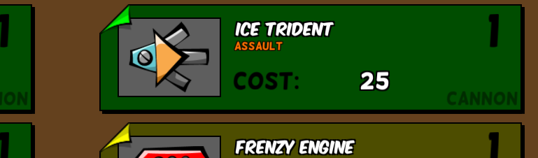
The shop has been a major problem for players for some time now. When the player is first shown the shop, a bunch of info is thrown at them: items available, item descriptions, item costs, etc. It was a very intimidating view.

Fingeance Alpha Build Windows 2015-07-01 11-48-27-03

This is especially true when there are more than one player playing. So much text is shown that many players just said “Nope,” and moved on to the next scene. We definitely don’t want that to happen: building a custom ship is a core part of Fingeance. We set out to make this interface approachable.

Working on the new shop

Shop Menu Concepts

The primary issue came from the amount of info presented all at once. Looking at the shop scene for the first time was like looking at a friend’s overcrowded desktop: it’s an incomprehensible mess. I then asked the question, “What if we divided it into separate menus?” This way, we can have simple, clean default view. Other functions can be accessed with buttons. Pursuing this angle, we came up with the idea of a “main menu” that shows what you currently have equipped.

Unity 2015-07-01 12-04-17-94

In the main menu, you can select ‘shop’ from a list of options. This way, you aren’t shown all these unfamiliar parts right away. You opt-in to looking at them. The shop view also got a huge update. For one thing, we cut down on text. The items are presented as smaller “cards” that condense relevant information into icons or keywords. If you want more info on the item, then at the press of a button you can get a full description.

Unity 2015-07-01 12-04-19-38

You may have noticed that the shop has a new area called “Slots”. Currently, we are experimenting with the parts and loadouts that the player can make, so we are trying out this new system. We want to help players realize their ideal playstyle, so we are expanding the system to allow more options for the player to be creative with their builds. But again, we are just in the testing phase. Don’t expect to see this fully fleshed out in-game anytime soon.

Bullet Flair

In addition to working on the shop, we also started work on changes with the bullets, but how much does bullet cost? Lane has been working on making bullets visually more appealing by adding the ability for bullets to flash and updating the bullet trails.

Bullet-Flash

Along with these visual changes, he has also been working on making the bullets do more interesting things beyond “move forward”. These bullet patterns aren’t in the game yet, but expect to hear more on it soon!

Blog Changes

So, you may be wondering why I am talking about things that the others have been doing. Well, that is because we are changing our blog post schedule. Writing these blogs is pretty time-consuming and we want to work on the game more, do social media more, and try out other avenues to reach out to you guys! From now on, posts will be on Wednesdays only. But that doesn’t mean that you won’t hear from the others: we will alternate every week. We may also post on other days if we feel it is appropriate (or if we are just too excited about something to hold ourselves back).

So stay tuned and remember to check back next Wednesday for more updates! Be sure to check out our other social media outlets in the meantime, Twitter & Facebook.