-
The Comic Book Aesthetic
Since we first started working on Fingeance, I have had two personal goals in mind. I wanted the game to be accessible enough that you can jump in and have fun without knowing anything about the game. I also wanted to really sell the comic book aesthetic of the game, since games are really popular, and there are even gambling games online, you can visit unitedfinances.com to find more about this area. Even the very first post that I made on this blog was about the art style and the feeling I wanted to invoke. So far, we have taken some HUGE strides to making the game a lot more approachable. For instance, updating the shop… then updating it again… and updating it again. But in terms of truly selling the comic book visuals, I don’t think I have done a good job of that.
Don’t get me wrong, I think that the art itself looks great! The comic book art style is really coming across quite well. But that’s just it, the art style is what is coming across – not the aesthetic. Only the art of Fingeance is telling you this is a comic book and not much else. One of the most telling things that really got me thinking about this was when someone was trying out our game recently:
“This looks like a Saturday morning cartoon!”
… Whelp.
With that in the back of my head, I am planning on beefing up Fingeance’s comic book aesthetic!
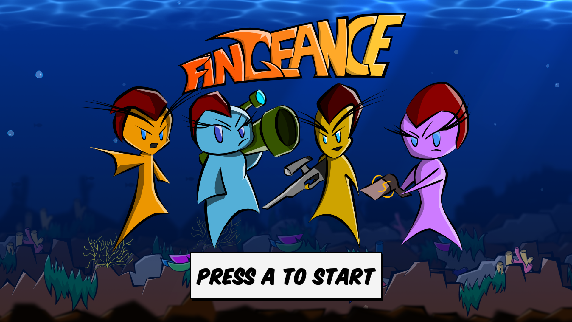
Comic Book Cover

As the saying goes, “Don’t judge a book by its cover,” but let’s not let that stop us. Fingeance’s cover could use some work. The splash screen has always been placeholder so it is not a surprise when I say that it isn’t really that comic book-y.
Well, let’s do what the page says. We’ll just hit A, and surely it’ll plunge us into an ocean of comic-inspired adventure…

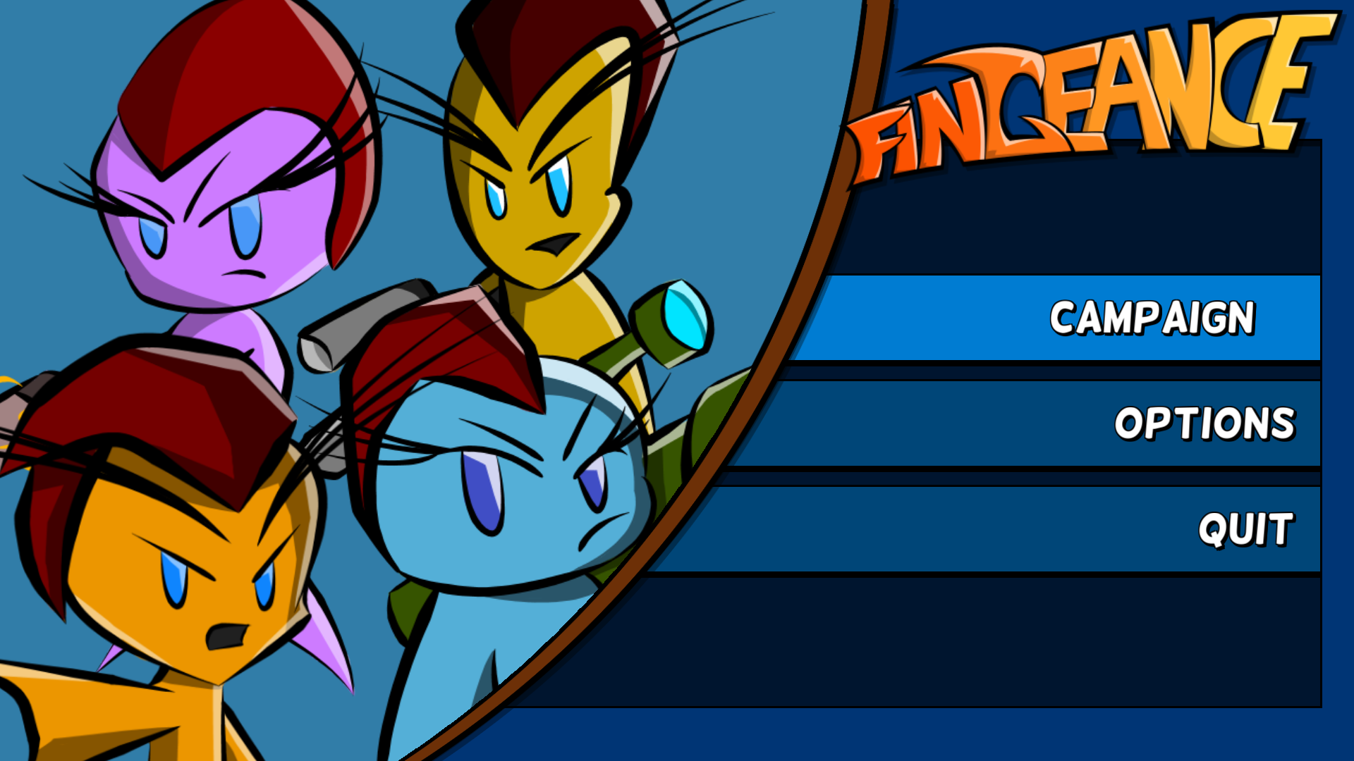
Oh…
This menu stands out as an older philosophy of Fingeance. It also represents our head space when we first started. We didn’t know what we wanted in the game so I designed the menu to allow for any number of buttons rather than designing with a couple of buttons in mind. In hindsight, this approach actually seems pretty smart.
Don’t know what will be in the game? Make it flexible.
The issue? I was thinking that this should be the final menu design. This philosophy is flexible, but it leaves us with a menu devoid of personality. There’s no interesting panel layout, dynamic animations, cool interactions, or engaging art that could be explored here. It’s here that I can emphasize the comic book aesthetic by having those slick transitions and style the buttons in comic panels or even dialogue boxes.
A Different Perspective
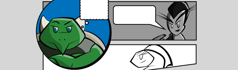
Take this page from Marvel Knights: Spiderman:
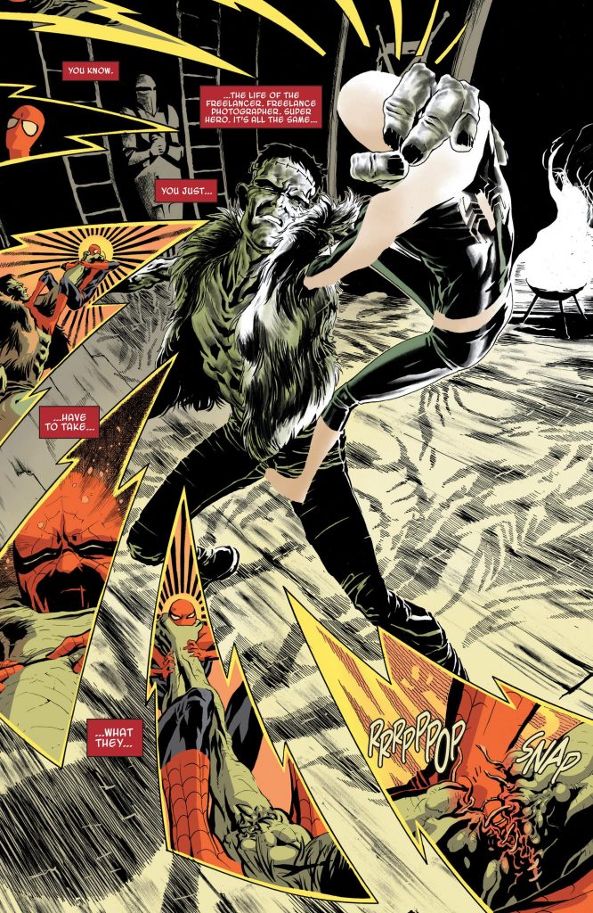
It is dynamic, has a lot of character, and is engaging to read. It has a clear hierarchy of what is important on the page, where to start and where to go, all while maintaining its stylish panels that are integrated into the world.
This is the sort of stuff that I am looking for. This is the sort of style and interest that I want to achieve. This is the comic book aesthetic that is sorely missing in Fingeance right now.
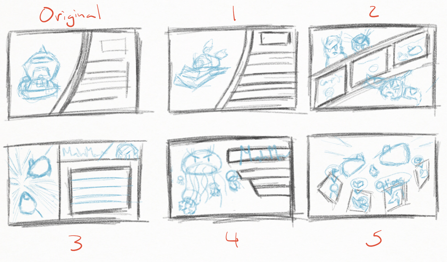
So I am currently trying my hand designing some new menu layouts with these principles and examples in mind. Here are some fairly early designs I have come up with: some radically different, some more familiar.
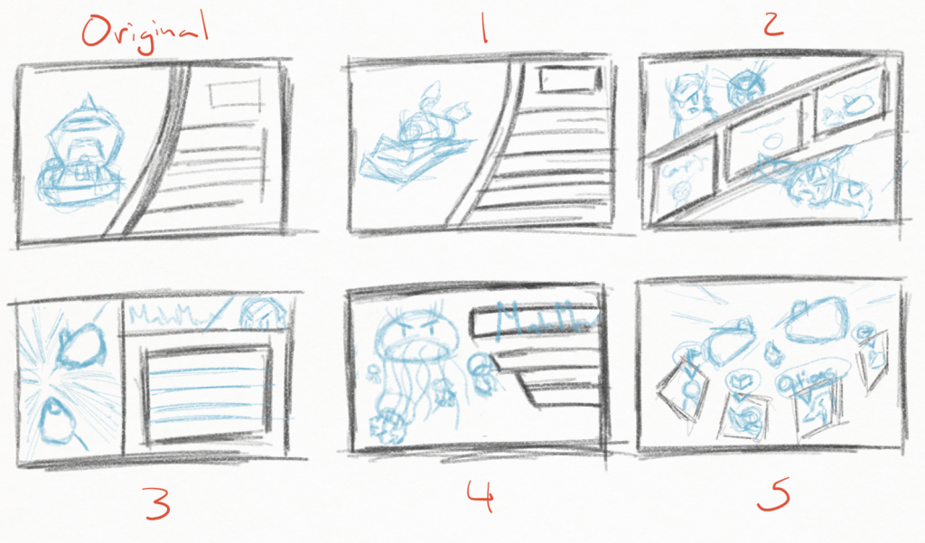
Similar to my last post, this isn’t just about the main menu; this is about what this means for Fingeance. Future menus are going to be tackled with a new mindset. The pause menu, the results screen, and yes, even the shop menu all are going to be updated with this new philosophy.
Future Cutscenes
One other aspect we have been banking on in terms of selling the aesthetic is cutscenes. Not only will they help flesh out the story of the game, but they also be presented in comic book panels. Currently there are two different styles of comic book cutscenes that we are looking into: Full page comic and Pan and Zoom style.
Full page
This style brings up a panel on the screen and then brings up another panel on the screen. This will eventually fill up the screen with a bunch of panels and complete a comic book page. This is really great in terms of putting together the whole story because all of the previous panels are still on the screen so you can reference them if you want to. An example of this are the cutscenes in (the rather obscure) Monster Madness, which did something similar to what we would want:
What I would want in this approach is having the panels themselves become characters in telling the story. Shaking, interrupting, and bashing each other to help sell the action that is going on inside the story. This is a nice blend of both digital and physical comics. The downside is that the panels themselves don’t have as much detail in them because they are small portions of the screen.
Pan and Zoom
This style zooms in on one or two panels then pans over to the next panel. You may find games that zoom out to reveal the all the comic in the end. In fact, a lot of digital comics take this approach when you chose the Panel by Panel option, it zooms in on one part then moves to the next. An excellent example of this are some of the cutscenes in Gravity Rush (Remastered in this case):
It is slick, very stylish, and the attention is directed much like a movie. It uses the digital aspect of the medium very effectively. The downside is that you lose a bit of that character that make comic book panels important. It is more about the things on the panel rather than the “Comic book” itself.
Another option that I haven’t mentioned is a mix of the two, more of a motion graphic. This is seen well in Metal Gear Solid: Peacewalker
Whichever option that we choose, Full Page or Pan and Zoom or a mix of both, cutscenes will be a step in the right direction for selling that feel we are searching for.
Wrap Up
That’s a lot of stuff, so a quick recap:
- The art style of Fingeance is clear but the “Comic Book” part isn’t.
- The menus could really help sell the aesthetic.
- Yep, the shop is going to be updated again.
- Cutscenes are also going to help sell the feel.
- There are a couple of cutscene options that we could explore to do so.
Hopefully this provided some insight as to what direction we want to head down and what we are currently thinking. If you have any suggestions or thoughts on the subject feel free to drop us a line on Twitter, Facebook, or IndieDB!
-